A galloping overview
Let’s first get a bird’s-eye view of the parts of the search process: text comes in and gets processed and stored in a database (called an index); a user submits a query; documents that match the query are retrieved from the index, ranked based on how well they match the query, and are then presented to the user. That sounds easy enough, but each step hides a wealth of detail. Today we’ll focus on another part of the step where “text gets processed”—and look at normalization.[1]
Also keep in mind that humans and computers have very different strengths, and what is easy to one can be incredibly hard for the other.
A foolish consistency
The simplest kind of normalization that readers of Latin, Greek, Cyrillic, Armenian and many other scripts often don’t even notice is case—that is, uppercase vs. lowercase. For general text, we want Wikipedia, wikipedia, WIKIpedia, wikiPEDIA, and WiKiPeDiA to all be treated the same. The usual method is to convert everything to lowercase.
There are exceptions—called capitonyms—where the capitalized form means something different. In English, we have March/march, May/may, August/august—so many months!—Polish/polish, Hamlet/hamlet, and others. In German, where nouns are always capitalized, there are also words that differ only by capitalization, such as Laut (“sound”) and laut (“loud”). Their conflation through lowercasing is often something we just have to live with.
As with everything else when dealing with the diversity of the world’s languages, there isn’t just one “right” way to do things. A speaker of English, for example, will tell you that the lowercase version of I is i, while a Turkish speaker would have to disagree, because Turkish has a dotted uppercase İ and dotless lowercase ı, and the corresponding pairs are İ/i and I/ı. As a result, we lowercase I differently on Turkish wikis than we do on other wikis in other languages. Cyrillic Г (“ge”) has different lowercase forms in Russian, Bulgarian, and Serbian, and then different italic lowercase forms in those languages as well.
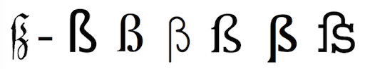
Other complications include German ß, which, depending on who and when you ask, might or might not have an uppercase form. It can be capitalized as SS,[2] or using an uppercase version (that is not well supported by typical fonts), and was only accepted by the Council for German Orthography in 2017.
There are also uppercase vs. lowercase complications with digraphs used in some languages, like Dutch ij or Serbian dž, lj, or nj—which are treated as single letters in the alphabet. The Serbian letters have three case variants: ALL CAPS DŽ / LJ / NJ, Title Case Dž / Lj / Nj, and lowercase dž / lj, nj. The Dutch letter, in contrast, only comes in two variants, UPPERCASE IJ and lowercase ij. Though they are usually typed as two letters, there are distinct Unicode characters for all three variants: i.e., DŽ, Dž, and dž, but only IJ and ij.
The calculus of variations
Another common form of normalization is to replace “variant” forms of a character with the more “typical” version. For example, we might replace the aforementioned single Serbian character dž with two separate characters: d and ž; or Dutch ij with i and j. Unicode also has precomposed single-character roman numerals—like ⅲ and Ⅷ—and breaking them up into iii and VIII makes them much easier to search for.
So-called “stylistic ligatures” are also relatively common. For example, in some typefaces, the letter f tends to not sit well with a following letter, particularly i and l; either there’s too much space between the letters, or the top of the f is too close to the following letter. To solve this problem, ligatures—a single character made by combining multiple characters—are used. The most common in English are ff, fl, fi, ffi, and ffl. Open almost any book in English (in a serif font and published by a large publisher) and you’ll find these ligatures on almost every page. The most obvious is often fi, which is usually missing the dot on the i (in a serif font—not necessary in a sans-serif font).[3] Some stylistic ligatures, like the st ligature (st) are more about looking fancy.
Other ligatures, like æ, œ, and ß (see footnote 1) can—depending on the language—be full-fledged independent letters, or just stylistic/posh/pretentious ways of writing the two letters. Separating them can make matching words like encyclopaedia and encyclopædia easier.
Non-Latin variants abound! Greek sigma (Σ/σ) has a word-final variant, ς, which is probably best indexed as “regular” σ. Many Arabic letters have multiple forms—as many as four: for initial, medial, final, and stand-alone variants. For example, bāʾ has four forms: ب, ـب, ـبـ, بـ.
For other letters, their status as “variants” is language dependent. In English, we often don’t care much about diacritics. The names Zoë and Zoe are—with apologies to people with those names—more or less equivalent, and you have to remember who uses the diaeresis[4] and who doesn’t. Similarly, while résumé or resumé always refer to your CV, resume often does, too. In Russian, the Cyrillic letter Ё/ё is treated as essentially the same as Е/е, and many people don’t bother to type the diaeresis—except in dictionaries and encyclopedias. So, of course, we have to merge them on Russian-language wikis. In other languages, such as Belarusian and Rusyn, the letters are treated as distinct. And, whether you want to keep the diacritics or not, you may still need to normalize them. For example, you can use a single Unicode character,[5] é, or a regular e combined with a “combining diacritic”, é, which is two characters, not one.[6] Similarly, in Cyrillic, ё and й are one character each, while ё and й are two characters each.
Some characters are difficult to tell apart, while others are hard to identify—and even if you could identify them, could you type them? Normalizing them to their unaccented counterpart makes a lot of sense in many cases. My general rule of thumb is that if a letter is a separate letter in a language’s alphabet, then it needs to be a separate letter when you normalize that language for search. Russian is an exception, but it’s a good first place to start.
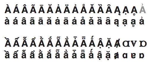
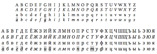
Below is a collection of letters related to A/a, presented in image form just in case you don’t have the fonts to support them all. All of them except one (in grey) are separate Unicode characters.[7] For some reason, there is a “latin small letter a with right half ring”[8] but no version with a capital A. Good thing we don’t need to convert it to uppercase it for searching!
Now for our last character-level variation to consider: in some applications, it makes sense to normalize characters across writing systems. For example, numbers probably do represent the same thing across writing systems, and where multiple version are common, it makes sense to normalize them to one common form. Thus, on Arabic-language wikis, Eastern Arabic numerals are normalized to Western Arabic numerals so that searching for ١٩٨٤ will find 1984, and vice versa. For multi-script languages, where the conversion is possible to do at search time, it makes sense to normalize to one writing system for searching. In Serbian-language wikis, Cyrillic is normalized to Latin; in Chinese-language wikis, Traditional characters are normalized to Simplified characters.[9]
Further reading / Homework
You can read more about the complexities of supporting Traditional and Simplified Chinese characters and Cyrillic and Latin versions of Serbian (and other multi-script languages) in one of my earlier blog posts, “Confound it!” Wikipedia has lots more information on the surprisingly complex topic of letter case, and the examples of ligatures in a wide variety of languages.
If you can’t wait for next time, I put together a poorly edited and mediocrely presented video in January of 2018, available on Wikimedia Commons, that covers the Bare-Bones Basics of Full-Text Search. It starts with no prerequisites, and covers tokenization and stemming, inverted indexes, basic boolean and proximity retrieval operations, TF/IDF and the vector space model of similarity, field-level indexing, using multiple indexes, and then touches on some of the elements of scoring.
Up next
In my next blog post, we will almost certainly actually look at stemming—which involves reducing a word to its base form, or a reasonable facsimile thereof—as well as stop words, and thesauri.
Trey Jones, Senior Software Engineer, Search Platform
Wikimedia Foundation
———
Footnotes
1. Last time I said we’d talk about stemming and other normalization, but character-level normalization kind of took over this post, so we’ll put off stemming and related topics until next time.
2. Why does a symbol that stands for an “s” sound look like a B (or Greek β)? Well, you see, long ago there was a written letter form in common use called long s—which looks like this (in whatever font your computer is willing and able to show it to you): ſ. It was historically written or printed in a way that looks like an integral sign or an esh: ʃ, or in a chopped-off version that looks like an f without the crossbar (or, maddeningly, with only the left half of the crossbar). If you take the long s and the regular s—ſs—and squish them together, and make the top of the long s reach over to the top of the regular s, you get an ß—whose name in German, Eszett, reflects that even earlier it was a long s and a tailed z: ſʒ.
A fun side note: optical character recognition (OCR) software generally isn’t trained on either form of long s, and often interprets it as an “f”. As a result, The Google Books Ngram Viewer will (incorrectly) tell you that fleek was wildly popular in the very early 1800s. In reality, it’s usually “sleek” written with a long s (for example: full height or chopped), or some other unusual character, like a ligature of long s and t in Scots/Scottish English “steek”.
Typography is fun!
3. A small miscellany: Turkish, which distinguishes dotted i and dotless ı doesn’t use the fi ligature since it often removes the dot. The spacing between letters is called kerning, and once you start paying attention to it, you can find poor kerning everywhere. Finally, another character that most people don’t use in their everyday writing—but which shows up a lot in printed books—is the em dash (i.e., —); I personally love it—obviously.
4. The technical name for the double-dot diacritic ( ¨ ) is “diaeresis” or “trema”, though many English speakers call it an “umlaut”, because one of its common uses is to mark umlaut in German—which is a kind of sound change. In English, the diaeresis is usually used to mark that two adjacent vowels are separate syllables—e.g., Chloë and Zoë rhyme with Joey, not Joe, and naïve is not pronounced like knave. For extra pretentiousness points, you can use it in words like coöperate and reënter, too—or you can just use a hyphen: co-operate, re-enter—though doing so may mess with your tokenization!
5. The term “Unicode character” can be more than a little ambiguous. It can refer to a code point, which is the numerical representation of the Unicode entity, which is what the computer deals with. It can refer to a grapheme which is an atomic unit of a writing system, which is usually what humans are thinking about. You can also talk about a glyph, which is the specific shape of a grapheme—for example in a particular font. There are invisible characters used for formatting that have a code point but no glyph, surrogate code points that can pair up in many ways to represent a Chinese character as a single glyph, special “non-characters,” and lots of other weird corner cases. It’s complicated, so people often just use “character” and sort out the details as needed.
6. This kind of normalization is relatively common, and there’s a reasonable chance that between me writing this and it getting published on the Wikimedia blog, some software along the way will convert my two-character é to the one-character é. Not all letter+diacritic combinations have precomposed equivalents, though.
7. You may have noticed that in the last row of lowercase a’s, the third from the right has a different shape. Different fonts can and do use either of the letter shapes as their base form, but in more traditional typography, the a with the hook on top is the “regular” or “roman” form, and the rounder one is the “italic” form. Lowercase g can have a similar difference in form, and there is also a Unicode character for the specific “single-story” g—“latin small letter script g” (see footnote 6). Some Cyrillic letters also have very different italic forms—see the grey highlighted examples below.
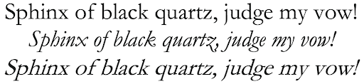
For the typography nerds, traditional italic versions of a font have distinct forms. When they are just slanted versions of the roman forms, they are technically “oblique”, rather than italic. Below is the same pangram in the font Garamond, set in roman, italic, and oblique type.
8. Unicode descriptions of characters are always in ALL CAPITAL LETTERS / small caps. Why? Because we like it that way! Seriously, though, I don’t really know why. Hmmm.
9. Chinese is a case where real life gets a bit messier than our idealized abstraction. Sometimes you have to do some normalization before tokenization. Because Chinese doesn’t use spaces, tokenization is much more difficult than it is for English and other European languages. The software we use that does tokenization only works on Simplified characters, so we have to normalize Traditional characters to Simplified before tokenization.